What you should know first: read React Part 1: What Is React and How to Build Your First React App and React Part 2: JSX Explained. You should be able to start a Vite project and write simple JSX with curly braces.
Every React app, from a small to-do list to Instagram’s web app, is built from one idea: React components and props. A component is a small, reusable piece of UI, like a button, a card or a whole page section. Props are the inputs you give a component so the same piece of UI can show different data. In this third part of the React series you will write your first components, split a page into a component tree, pass data with props, use the special children prop and build a small product list with a reusable ProductCard. Every example was run with React 19 and the output you see is real.
- A component is a JavaScript function whose name starts with a capital letter and which returns JSX. You use it like a tag:
<Greeting />. - Props are the attributes you write on that tag. React collects them into one object and passes it as the first argument of the function.
- Destructure props in the function signature:
function UserCard({ name, city = "Remote" }). The= "Remote"part is a default value. - Props are read-only. Data flows one way, from parent to child. A child never changes its props.
- The
childrenprop holds whatever you put between the opening and closing tags, which lets you build wrapper components such asCardorLayout. - You can pass any value as a prop: text, numbers, booleans, objects, arrays, other JSX and functions.
Full React roadmap (30 parts)
Beginner
- What Is React and How to Build Your First React App
- JSX Explained: Writing HTML-Like Code in JavaScript
- Components and Props: Building Reusable UI You are here
- State with useState: Making Components Interactive Coming soon
- Handling Events and Forms in React Coming soon
- Conditional Rendering and Lists with Keys Coming soon
- Styling React Apps: Plain CSS, CSS Modules and Tailwind Coming soon
- useEffect: Side Effects, Data Fetching and Cleanup Coming soon
- Lifting State Up: Sharing Data Between Components Coming soon
- Mini Project: Build a To-Do App with React Coming soon
Intermediate
- useRef: Working with the DOM and Keeping Values Coming soon
- useContext: Sharing Data Without Prop Drilling Coming soon
- useReducer: Managing Complex State Coming soon
- Custom Hooks: Reusing Logic Across Components Coming soon
- React Router: Pages, Links and Dynamic Routes Coming soon
- Fetching Server Data with TanStack Query Coming soon
- Forms the Modern Way: Actions, useActionState and Validation Coming soon
- React with TypeScript: Typing Props, State and Events Coming soon
- Global State: Context vs Zustand vs Redux Toolkit Coming soon
- Testing React Apps with Vitest and React Testing Library Coming soon
Advanced
- How Rendering Works: Re-renders, Reconciliation and Keys Coming soon
- Performance: memo, useMemo, useCallback and the React Compiler Coming soon
- Code Splitting with lazy() and Suspense Coming soon
- Concurrent React: useTransition and useDeferredValue Coming soon
- Error Boundaries and Handling Errors Gracefully Coming soon
- The use() API and Optimistic UI with useOptimistic Coming soon
- React Server Components and Server Functions Coming soon
- Accessibility in React Apps Coming soon
- React Patterns for Large Apps: Folder Structure and Composition Coming soon
- Final Project: Build and Deploy a Complete React App Coming soon
What are React components?
Look at any website and you will see repeated pieces: the same kind of card for every product, the same button style everywhere, the same header on every page. In plain HTML you copy and paste that markup again and again. When the design changes, you have to fix every copy.
A React component solves this. You write the markup once, inside a function, give it a name and then reuse it as many times as you like. The official React docs describe components as “JavaScript functions that you can sprinkle with markup” (see Your First Component on react.dev).
Button once and use it on every page.<Header /><ProductList /><Footer /> tells you the page layout at a glance.ProductCard and every card on the site is fixed.class App extends React.Component). They still work, but all new React code, and this whole series, uses function components with hooks.Your first component
Start with the Vite project from Part 1, or create a fresh one:
# Start from the Vite + React project you made in Part 1
$ npm create vite@latest react-components -- --template react
$ cd react-components && npm install
# Create a folder for your components
$ mkdir src/components
$ npm run dev
# Open the local URL Vite prints (usually http://localhost:5173)
A component needs only three things: a function, a name that starts with a capital letter, and a return with JSX. Put each component in its own file and export it so other files can import it.
// A component is a JavaScript function that returns JSX
export default function Greeting() {
  return <h2 className="greeting">Hello from my first component!</h2>;
}import Greeting from "./Greeting.jsx";
export default function App() {
return (
<main>
<h1>My React App</h1>
<Greeting />
<Greeting />
</main>
);
}$ npx esbuild print.jsx --bundle --platform=node --jsx=automatic --outfile=out.js && node out.js
<main>
<h1>My React App</h1>
<h2 class="greeting">Hello from my first component!</h2>
<h2 class="greeting">Hello from my first component!</h2>
</main>import { renderToStaticMarkup } from "react-dom/server";
import App from "./App.jsx";
console.log(renderToStaticMarkup(<App />).replaceAll("><", ">\n<"));Click the three tabs to see each file, then open App.jsx and click ▶ Run to see the HTML that React creates.
A few things to notice:
Greetingstarts with a capital G. React uses this to tell your components apart from HTML tags.<greeting />(lowercase) would be treated as an unknown HTML tag.export defaultmakes the component the main export of the file, andimport Greeting from "./Greeting.jsx"brings it in.- We used
<Greeting />twice and got two headings. That is reuse in its simplest form. - The
print.jsxfile is only for this article: it usesrenderToStaticMarkupfromreact-dom/serverto print the HTML in the terminal. In your Vite app,main.jsxrendersAppinto the browser as you saw in Part 1.
If you want to try the terminal trick yourself, this is the exact command we used for every example in this post:
# Optional: see the HTML a component makes, without a browser
$ npm install -D esbuild
$ npx esbuild print.jsx --bundle --platform=node --jsx=automatic --outfile=out.js && node out.jsThinking in components
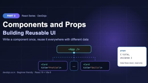
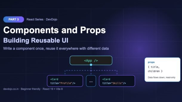
Before you write code for a new screen, draw boxes around each part of the design and give each box a name. A box that appears several times, or that has one clear job, is a good component. Boxes inside boxes become child components. The result is a component tree with App at the top.
App at the top.A simple rule from the React team: a component should ideally do one thing. If it grows too big, split it into smaller children. For the page above, App renders Header, ProductList and Footer, and ProductList renders one ProductCard per product. But how does each card know which product to show? That is where props come in.
What are props in React?
Props (short for “properties”) are the inputs of a component. You pass them exactly like HTML attributes. React collects all of them into one object and hands it to your function as its first argument. Think of a component as a function and props as its arguments: <UserCard name="Asha" /> is like calling UserCard({ name: "Asha" }).
// Props arrive as ONE object. We destructure the keys we need.
function UserCard({ name, role, city = "Remote" }) {
  return (
    <div className="user-card">
      <h3>{name}</h3>
      <p>{role} · {city}</p>
    </div>
  );
}

export default function App() {
  return (
    <section>
      <UserCard name="Asha" role="Frontend Developer" city="Pune" />
      <UserCard name="Rahul" role="Backend Developer" city="Bengaluru" />
      <UserCard name="Meera" role="Designer" />
    </section>
  );
}$ npx esbuild print.jsx --bundle --platform=node --jsx=automatic --outfile=out.js && node out.js
<section>
<div class="user-card">
<h3>Asha</h3>
<p>Frontend Developer · Pune</p>
</div>
<div class="user-card">
<h3>Rahul</h3>
<p>Backend Developer · Bengaluru</p>
</div>
<div class="user-card">
<h3>Meera</h3>
<p>Designer · Remote</p>
</div>
</section>Click ▶ Run. Notice Meera gets the default city “Remote” because no city prop was passed.
Here the function signature uses destructuring: { name, role, city = "Remote" } pulls those three keys out of the props object. It is the same as writing function UserCard(props) and then props.name, but shorter and easier to read. The = "Remote" part is a default value; it is used only when the prop is missing (or undefined).
Component.defaultProps = {...} for function components. Use default values in destructuring, as shown above.Props are read-only
Props belong to the parent. The child can read them, but it must never change them. This is called one-way data flow: data moves down the tree, from parent to child, and that makes apps much easier to understand and debug.
React even protects you here. In development mode the props object is frozen, so trying to change it throws an error:
function Badge(props) {
  props.label = "Changed!"; // ❌ never change props
  return <span>{props.label}</span>;
}

function FixedBadge({ label }) {
  const text = label.toUpperCase(); // ✅ make a new value instead
  return <span>{text}</span>;
}$ NODE_ENV=development node out.mjs
TypeError: Cannot assign to read only property 'label' of object '#<Object>'Click ▶ Run to see the error React throws in development mode when a component changes its props.
So what do you do when something should change, like a counter or a “liked” button? You use state, which is exactly what we cover in the next part. For now remember: props are the settings a parent gives, state is the memory a component keeps for itself.
The children prop: building wrapper components
Sometimes you want a component that wraps other content, like a card, a modal or a page layout. Whatever you place between the opening and closing tags arrives in a special prop called children.
// "children" is whatever you put between <Card> and </Card>
function Card({ title, children }) {
  return (
    <div className="card">
      <h3 className="card-title">{title}</h3>
      <div className="card-body">{children}</div>
    </div>
  );
}

export default function App() {
  return (
    <>
      <Card title="Profile">
        <p>Asha is learning React.</p>
      </Card>
      <Card title="Skills">
        <ul>
          <li>HTML</li>
          <li>JavaScript</li>
        </ul>
      </Card>
    </>
  );
}$ npx esbuild print.jsx --bundle --platform=node --jsx=automatic --outfile=out.js && node out.js
<div class="card">
<h3 class="card-title">Profile</h3>
<div class="card-body">
<p>Asha is learning React.</p>
</div>
</div>
<div class="card">
<h3 class="card-title">Skills</h3>
<div class="card-body">
<ul>
<li>HTML</li>
<li>JavaScript</li>
</ul>
</div>
</div>Click ▶ Run to see how the content between the tags lands inside card-body.
The Card does not care what is inside it: a paragraph, a list, even other components. This pattern is called composition, and it is how most layout components (Layout, Modal, Panel) are built. You will use it everywhere.
What can you pass as a prop?
Almost anything. Click through the tabs to see the four kinds of values you will use most often:
Strings use quotes, everything else uses curly braces. Write title="Hello" for plain text. For numbers and any JavaScript expression use braces: price={899}, total={price * qty}. If you write price="899" the child receives the text “899”, not a number, and maths like price + 1 gives “8991”.
Booleans switch things on and off. Writing just the name, like <ProductCard showBadge />, is the same as showBadge={true}. Leave it out and the value is undefined, which acts like false. Use showBadge={false} when you want to be clear. Common uses: disabled, isActive, isOpen.
Pass whole objects and arrays. product={product} sends one object, so the child can read product.name and product.price. Arrays work the same: tags={["usb", "office"]}. Notice the double braces in style={{ color: "red" }}: the outer pair means “JavaScript here”, the inner pair is the object. You can also spread an object into props with <UserCard {...user} />.
Functions let the child talk back to the parent. The parent passes onBuy={handleBuy}; the child calls onBuy(name) when the button is clicked. By convention, props that are functions start with on (onClick, onSave), and the parent’s handler starts with handle. Pass the function itself, not handleBuy(), or it runs immediately during render.
Build a reusable ProductCard
Let’s put everything together. One ProductCard component receives a product object, a function prop and a boolean prop. The parent App loops over an array with map() (you saw this in Part 2) and renders one card per product. Each card gets a key so React can track it; we go deeper into keys in Part 6.
export default function ProductCard({ product, onBuy, showBadge = false }) {
  const { name, price, inStock, tags } = product;

  return (
    <article className="product">
      {showBadge && <span className="badge">Best seller</span>}
      <h3>{name}</h3>
      <p className="price">₹{price.toLocaleString("en-IN")}</p>
      <p>{inStock ? "In stock" : "Out of stock"}</p>
      <p className="tags">{tags.join(", ")}</p>
      <button disabled={!inStock} onClick={() => onBuy(name)}>
        Buy now
      </button>
    </article>
  );
}import ProductCard from "./ProductCard.jsx";
const products = [
{ id: 1, name: "Wireless Mouse", price: 899, inStock: true, tags: ["usb", "office"] },
{ id: 2, name: "Mechanical Keyboard", price: 3499, inStock: true, tags: ["rgb", "gaming"] },
{ id: 3, name: "4K Monitor", price: 24999, inStock: false, tags: ["display"] },
];
function handleBuy(name) {
console.log(`Added ${name} to cart`);
}
export default function App() {
return (
<div className="shop">
{products.map((p) => (
<ProductCard key={p.id} product={p} onBuy={handleBuy} showBadge={p.id === 2} />
))}
</div>
);
}$ npx esbuild print.jsx --bundle --platform=node --jsx=automatic --outfile=out.js && node out.js
<div class="shop">
<article class="product">
<h3>Wireless Mouse</h3>
<p class="price">₹899</p>
<p>In stock</p>
<p class="tags">usb, office</p>
<button>Buy now</button>
</article>
<article class="product">
<span class="badge">Best seller</span>
<h3>Mechanical Keyboard</h3>
<p class="price">₹3,499</p>
<p>In stock</p>
<p class="tags">rgb, gaming</p>
<button>Buy now</button>
</article>
<article class="product">
<h3>4K Monitor</h3>
<p class="price">₹24,999</p>
<p>Out of stock</p>
<p class="tags">display</p>
<button disabled="">Buy now</button>
</article>
</div>Open the App.jsx tab and click ▶ Run. The disabled button and the “Best seller” badge both come from props.
Look at the output: the same component produced three different cards. The price is formatted in Indian style with toLocaleString("en-IN"), the out-of-stock monitor has disabled on its button, and only the keyboard shows the badge. In the browser, clicking “Buy now” calls handleBuy in the parent, which logs Added Mechanical Keyboard to cart in the console.
To use it in your Vite app, save ProductCard.jsx in src/components/, put the App code in src/App.jsx (adjust the import path to ./components/ProductCard.jsx) and run npm run dev.
Common errors and fixes
| Problem or message | Why it happens | Fix |
|---|---|---|
| Component does not show, warning “The tag <greeting> is unrecognized in this browser” | Component name starts with a lowercase letter | Rename to Greeting (PascalCase) |
| “does not provide an export named ‘default'” | The file uses a named export (export function Card) but you import it as default | Use import { Card } from "./Card.jsx", or add export default |
| “Cannot read properties of undefined (reading ‘name’)” | The parent forgot to pass the product prop, or misspelled it | Check the prop name on both sides; add a default or a guard |
| “Cannot assign to read only property” | The component tried to change its props | Make a new variable, or move the value into state (Part 4) |
Prop is undefined even though you passed it | You wrote function Card(title) instead of function Card({ title }) | Add the curly braces to destructure, or use props.title |
| Function runs on load, or “Too many re-renders” | You passed onBuy={handleBuy()} (called it) instead of the function | Pass onBuy={handleBuy} or onBuy={() => handleBuy(id)} |
| “Each child in a list should have a unique key prop” | Rendering an array with map() without key | Add key={item.id} to the outer element |
Best practices for React components and props
- One component per file, file name equals component name:
ProductCard.jsxexportsProductCard. - Keep components small and focused on one job. If you scroll a lot inside one component, split it.
- Destructure props in the signature and give defaults for optional ones.
- Name props clearly:
isOpen,hasErrorfor booleans;onSomethingfor functions. - Pass only what a component needs. Prefer
nameandpriceover a huge object with fifty fields when the card uses two. - Use
childrenfor layout instead of many props likebodyText,bodyList,bodyImage. - Keep components pure: same props in, same JSX out. No changing props or outside variables during render. This also lets the React Compiler optimise your code automatically later.
Practice task
Build a small “Team” page in your Vite project:
- Create
src/components/Avatar.jsxthat takesnameandsize(default48) and shows a circle with the person’s first letter. - Create
TeamMemberCard.jsxthat takesname,roleandisLead, renders<Avatar />and shows a “Team lead” label only whenisLeadis true. - Create a
Sectionwrapper that takes atitleand useschildren. - In
App.jsx, store four team members in an array and render them inside<Section title="Our team">withmap()and akey. - Bonus: add an
onSayHifunction prop that logs “Hi, <name>!” when a card’s button is clicked.
FAQ
What is the difference between a component and an element?
A component is the function you write, such as Greeting. An element is the small object that is created when you use it, <Greeting />. One component can produce many elements.
Why must component names start with a capital letter?
JSX uses the first letter to decide: lowercase tags like <div> are HTML elements, capitalised tags like <Card> are your components. A lowercase component name is treated as an unknown HTML tag.
Can a child component change its props?
No. Props are read-only. If a value needs to change, the parent keeps it in state and passes the new value down, or passes a function prop that the child calls.
What is prop drilling?
Passing a prop through many layers of components that do not use it, just to reach a deep child. It is fine for two or three levels. For deeper trees, React offers useContext, covered in Part 12.
Should I use PropTypes in React 19?
No. React 19 removed PropTypes checks for function components. For type safety use TypeScript, which we cover in Part 18 of this series.
Named export or default export?
Both work. Default exports are common for one main component per file. Named exports are handy when a file has several small components. Just make the import match the export.
Conclusion
You now know the two building blocks behind every React app. React components and props let you write a piece of UI once and reuse it with different data. You learned how to create and export a component, how to split a page into a component tree, how props arrive as one read-only object, how to set default values, how the children prop lets you build wrappers, and how to pass objects, booleans and functions to build a real ProductCard.
Need a refresher on curly braces and the JSX rules? Go back to React Part 2: JSX Explained. Want to read more on the official docs? See Passing Props to a Component on react.dev.
useState, build a counter and a like button, and learn why React re-renders.New posts every day on DevDojo
Follow the full React series – 30 parts from “what is React” to building and deploying a complete app. Bookmark devdojo.co.in and share your Practice task solution in the comments.