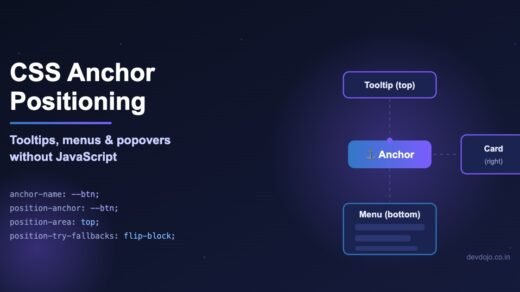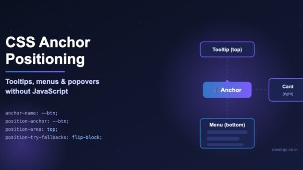
Every web app has small floating things: tooltips, dropdown menus, “more options” buttons, help bubbles. For years we needed a JavaScript library like Popper or Floating UI just to keep them stuck next to their button. CSS anchor positioning changes that. It lets you tie one element to another with a few lines of CSS, and the browser does the measuring, the scrolling and even the “flip to the other side if there is no room” logic for you.
In this CSS anchor positioning tutorial you will learn the core ideas step by step, build a real tooltip and a real dropdown menu, handle screen edges, avoid the most common mistakes, and use it safely in React. No libraries and no getBoundingClientRect().
- Put
anchor-name: --somethingon the element you want to attach to (the anchor). - On the floating element, set
position: absoluteorfixed, thenposition-anchor: --something. - Place it with
position-area(easy 3×3 grid) or theanchor()function (exact edges). - Add
position-try-fallbacks: flip-blockso it flips when it hits the edge of the screen. - Works in Chrome/Edge 125+, Safari 26+ and Firefox 147+, so the core feature is now usable in all major browsers.
What is CSS Anchor Positioning?
CSS anchor positioning is a browser feature that lets you position an element relative to another element anywhere on the page, not just relative to its parent. You give one element a name, and you tell another element “stay next to the element with this name”.
Before this, the classic CSS trick was to wrap the button and tooltip in a position: relative parent and use position: absolute on the tooltip. That works until the tooltip gets cut off by a parent with overflow: hidden, or it goes off-screen, or you need it to follow a button inside a scrolling list. Then you reached for JavaScript to measure positions on every scroll and resize.
With anchor positioning, the browser itself knows where the anchor is. Three ideas are all you need:
anchor-name: --my-btn.position-anchor: --my-btn.position-area: top, or exact edges with anchor().Browser Support Today
Chrome and Edge shipped anchor positioning in version 125 (May 2024). Safari added it in Safari 26, and Firefox followed in Firefox 147, which made the core feature available in every major browser. It is also part of the Interop 2026 effort, where browser makers work together on fixing remaining bugs.
anchor-name, position-anchor, position-area, anchor(), position-try-fallbacks) are safe to use. Some newer extras like position-visibility, anchor-scope and anchored container queries are still rolling out, so test them and keep a fallback. Always check the latest table on MDN’s anchor positioning guide.Your First Anchored Tooltip
Let’s start with the smallest working example. Here is the HTML. Notice the tooltip is a sibling of the button, not a child:
<button class="info-btn">What is this?</button>
<div class="tooltip">This tooltip is placed by CSS only.</div>
And here is the CSS:
/* 1. Give the anchor a name (it must start with two dashes) */
.info-btn {
  anchor-name: --info;
}

/* 2. Tie the floating element to that name */
.tooltip {
  position: absolute;          /* or fixed */
  position-anchor: --info;     /* "stick to the element called --info" */
  position-area: top;          /* sit above it, centered */
  margin-bottom: 8px;          /* small gap between the two */

  /* just styling */
  padding: 6px 10px;
  border-radius: 6px;
  background: #151b3b;
  color: #fff;
  font-size: 14px;
  white-space: nowrap;
}
That’s it. The tooltip now sits centered above the button. If the button moves because of a layout change, the tooltip moves with it. No JavaScript is watching anything.
--info, not info. A name without two dashes is invalid and is silently ignored.To show the tooltip only on hover or keyboard focus, add a simple toggle:
.tooltip { opacity: 0; transition: opacity .15s; pointer-events: none; }
.info-btn:hover + .tooltip,
.info-btn:focus-visible + .tooltip { opacity: 1; }
Placing Elements with position-area
position-area is the easiest way to place things. Imagine a 3×3 grid drawn around the anchor. The anchor is the middle cell. You simply name the cell (or cells) where the floating element should go.
Here are the values you will use most:
.tooltip { position-area: top; }               /* above, centered */
.tooltip { position-area: bottom; }            /* below, centered */
.tooltip { position-area: right; }             /* to the right, centered */
.tooltip { position-area: top left; }          /* top-left corner cell */
.tooltip { position-area: bottom span-right; } /* below, starts at the anchor's
                                                  center and grows to the right */
.tooltip { position-area: bottom span-all; }   /* below, as wide as all 3 columns */
Try it: position-area explorer
Click a value below to see which grid cell it fills. The dark cell is the anchor.
position-area: top;Centered above the anchor. Perfect for classic tooltips. Pair it with
margin-bottom for a gap.position-area: bottom;Centered below the anchor. Good for help text under form fields.
position-area: right;To the right, vertically centered. Great for sidebar icons and hover cards.
position-area: top left;The top-left corner cell. Use it for small badges or corner labels.
position-area: bottom span-right;Below the anchor, starting at its center and growing to the right. The usual choice for dropdown menus.
inset-area. It was renamed to position-area. Many old tutorials and AI-generated snippets still use inset-area, and the browser ignores it without any error.Exact Control with anchor() and anchor-size()
Sometimes you need pixel-level control, for example “the left edge of my menu should line up with the left edge of the button”. For that, use the anchor() function inside normal inset properties like top, left, right and bottom:
.tooltip {
  position: absolute;
  position-anchor: --info;

  /* top edge of tooltip = bottom edge of anchor */
  top: anchor(bottom);

  /* left edge of tooltip = left edge of anchor */
  left: anchor(left);

  /* you can even do math with it */
  margin-top: 6px;
  /* top: calc(anchor(bottom) + 6px);  works too */
}
Read top: anchor(bottom) as: “my top edge goes where the anchor’s bottom edge is”. You can use top, bottom, left, right, center, logical values like start and end, or a percentage such as anchor(50%).
The partner function anchor-size() reads the anchor’s size. A common use is making a dropdown exactly as wide as its button:
.dropdown {
  position: absolute;
  position-anchor: --select;
  position-area: bottom span-right;
  /* make the list exactly as wide as the button */
  width: anchor-size(width);
}position-area. It is shorter, easier to read and works nicely with flipping. Use anchor() only when you need a precise edge-to-edge alignment.Build a Dropdown Menu with popover
Anchor positioning becomes really powerful when combined with the HTML popover attribute. Popover gives you open/close behavior, “click outside to close”, the Esc key and the top layer (so it is never cut off by overflow: hidden). Anchor positioning gives you the placement. Together they replace most dropdown libraries.
<button class="menu-btn" popovertarget="user-menu">
  Account ▾
</button>

<div id="user-menu" popover>
  <a href="/profile">Profile</a>
  <a href="/settings">Settings</a>
  <a href="/logout">Log out</a>
</div>
.menu-btn {
anchor-name: --account;
}
#user-menu {
/* popovers already use position: fixed and live in the top layer */
position-anchor: --account;
position-area: bottom span-left; /* below, aligned to the button's right edge */
/* IMPORTANT: undo the browser's default "center the popover" styles */
inset: auto;
margin: 0;
margin-top: 6px;
/* flip above the button if there is no room below */
position-try-fallbacks: flip-block;
/* looks */
display: none;
padding: 6px;
min-width: 180px;
border: 1px solid #d9deef;
border-radius: 10px;
background: #fff;
box-shadow: 0 12px 30px rgba(15, 20, 48, .18);
}
#user-menu:popover-open {
display: grid;
}
#user-menu a {
padding: 8px 12px;
border-radius: 6px;
color: #1f2433;
text-decoration: none;
}
#user-menu a:hover {
background: #eef1fb;
}Clicking the button opens the menu right under it. Clicking outside or pressing Esc closes it. All of this works with zero lines of JavaScript.
inset: 0 and margin: auto so they appear in the middle of the screen. If you forget inset: auto and margin: 0, your menu will look stuck in the center and anchor positioning will seem “broken”.Newer Chromium versions also create an implicit anchor: a popover opened by a popovertarget button is automatically anchored to that button, so you could skip anchor-name. For now, setting anchor-name and position-anchor yourself is the safest choice across all browsers.
Flipping at Screen Edges with position-try-fallbacks
A tooltip placed on top looks great until the button is near the top of the screen. Then half the tooltip disappears. JavaScript libraries solved this with “flip” logic. CSS now has it built in with position-try-fallbacks.
.tooltip {
  position: fixed;
  position-anchor: --info;
  position-area: top;

  /* try these, in order, when "top" does not fit */
  position-try-fallbacks:
    flip-block,               /* top -> bottom          */
    flip-inline,              /* left <-> right         */
    flip-block flip-inline;   /* both at once (corners) */
}flip-blockmirrors the position across the block axis (top ↔ bottom in English text).flip-inlinemirrors across the inline axis (left ↔ right).flip-block flip-inlinewritten together (space, no comma) flips both at once, which is what you need for corner positions.- You can also list plain
position-areavalues likebottomorrightas fallbacks.
Custom fallbacks with @position-try
If a simple flip is not enough, define your own named fallback with @position-try. Inside it you can change position-area, insets, margins, sizes, alignment and position-anchor:
@position-try --right-side {
  position-area: right;
  margin: 0 0 0 10px;
  max-width: 220px;
}

@position-try --below-wide {
  position-area: bottom span-all;
  margin: 10px 0 0 0;
}

.tooltip {
  position: fixed;
  position-anchor: --info;
  position-area: top;
  margin-bottom: 10px;
  position-try-fallbacks: --right-side, flip-block, --below-wide;
}
The browser tries top first, then your custom right-side version, then the flipped version, then the wide one below. If nothing fits, it keeps the original position, so always design a “good enough” default.
Hiding a tooltip when its anchor scrolls away
If a tooltip is position: fixed and the button scrolls out of a container, the tooltip can be left floating alone. The newer position-visibility property fixes that:
.tooltip {
  position: fixed;
  position-anchor: --info;
  position-area: top;

  /* hide the tooltip when its anchor scrolls out of view */
  position-visibility: anchors-visible;
}
Use no-overflow instead if you want it hidden whenever it would overflow its container. Remember this property is newer, so treat it as a nice extra.
Many Anchors in a List (anchor-scope)
Here is a trap almost everyone hits. You have a list of team members, each with an avatar and a hover card. You put the same anchor-name: --avatar on every avatar. Result: every card attaches to the last avatar. When several elements share a name, the browser picks the last suitable one in the page.
<ul class="team">
  <li class="member">
    <img src="/asha.jpg" alt="Asha" class="avatar">
    <span class="card">Asha · Frontend lead</span>
  </li>
  <li class="member">
    <img src="/ravi.jpg" alt="Ravi" class="avatar">
    <span class="card">Ravi · Backend developer</span>
  </li>
  <!-- ...more members -->
</ul>
The clean fix is anchor-scope. It limits a name to one subtree, so each list item has its own private --avatar:
.member {
  anchor-scope: --avatar;   /* each <li> gets its own private "--avatar" */
}

.avatar {
  anchor-name: --avatar;    /* same name on every avatar is now OK */
}

.card {
  position: absolute;
  position-anchor: --avatar;
  position-area: right;
  margin-left: 8px;
  opacity: 0;
  pointer-events: none;
  transition: opacity .2s;
}

.member:hover .card,
.member:focus-within .card {
  opacity: 1;
}
If you need to support browsers without anchor-scope, or you render the list from data anyway, generate unique names per item:
<!-- No anchor-scope? Give each pair a unique name with inline styles -->
<li>
  <img class="avatar" style="anchor-name: --avatar-1" alt="Asha" src="/asha.jpg">
  <span class="card" style="position-anchor: --avatar-1">Asha · Frontend lead</span>
</li>
Using Anchor Positioning in React
Because this is plain CSS, it works in any framework: React, Next.js, Vue, Angular or plain HTML. In React, the main job is creating a unique anchor name per component instance. useId() is perfect for that. React 19 also supports the popover and popoverTarget attributes directly.
// Tooltip.jsx — works in React 19 (popover attributes are supported)
import { useId } from "react";

export default function Tooltip({ label, children }) {
  // useId() ids can contain characters like ":" or "«»" depending on the
  // React version, so keep only characters that are safe in a CSS name
  const id = useId().replace(/[^a-zA-Z0-9_-]/g, "");
  const anchor = `--tip-${id}`;

  return (
    <span className="tip-wrap">
      <button
        type="button"
        popoverTarget={`tip-${id}`}
        style={{ anchorName: anchor }}
      >
        {children}
      </button>

      <span
        id={`tip-${id}`}
        popover="auto"
        className="tip"
        style={{ positionAnchor: anchor }}
      >
        {label}
      </span>
    </span>
  );
}
.tip {
position-area: top;
position-try-fallbacks: flip-block;
inset: auto;
margin: 0 0 8px 0;
padding: 6px 10px;
border: 0;
border-radius: 6px;
background: #151b3b;
color: #fff;
}Every <Tooltip> now gets its own anchor, so you can render hundreds of them without the “all tooltips jump to the last button” bug. If you are using TypeScript and see errors on anchorName in the style object, update your React types or cast the style object. Our TypeScript 7 migration guide covers keeping your types and tooling up to date.
useEffect that measures the button and sets top/left on every scroll. If you are still learning how effects work and when to avoid them, read our post on the useEffect hook.Common Errors and Fixes
| Problem | Likely cause | Fix |
|---|---|---|
| Nothing happens at all | The floating element is not positioned | Add position: absolute or position: fixed. Anchor positioning only works on positioned elements. |
| Name is ignored | Name has no leading dashes (info) | Use a dashed name: --info. |
| Code from a tutorial does nothing | Old property names inset-area or position-try-options | Use position-area and position-try-fallbacks. |
| Popover stays in the middle of the screen | Default popover styles (inset: 0; margin: auto) | Add inset: auto; margin: 0; to the popover. |
| All tooltips attach to the last item | Same anchor-name used many times | Use anchor-scope on each item, or unique names per item. |
| Tooltip is clipped by a card | Parent has overflow: hidden and tooltip is absolute | Use position: fixed or make it a popover (top layer). |
| Anchor is not found when inside another positioned box | The anchor is in a different containing block that the browser cannot “see” | Move the tooltip next to the anchor in the DOM, or use position: fixed / popover. |
| Corner tooltip still goes off-screen | Only single-axis flips listed | Add flip-block flip-inline as an extra fallback. |
Supporting older browsers
Some users are on older phones or company laptops that update slowly. Use @supports to give them a simple position first and upgrade everyone else:
/* Default for old browsers: a simple, always-safe position */
.tooltip {
  position: absolute;
  top: 100%;
  left: 0;
}

/* Upgrade when anchor positioning is available */
@supports (anchor-name: --a) {
  .tooltip {
    top: auto;
    left: auto;
    position-anchor: --info;
    position-area: top;
    position-try-fallbacks: flip-block;
  }
}
There is also a community polyfill from OddBird if you must support older browsers fully, but it adds wrapper elements and does not handle anchors that are added later very well. For most sites, the @supports approach is simpler.
Best Practices
- Prefer
position-areaoveranchor()for normal tooltips and menus. It is shorter and flips cleanly. - Always add at least
flip-blockto anything that can be near the screen edge. - Use popover for menus and click-to-open panels. You get Esc to close, light dismiss and top-layer rendering for free.
- Keep accessibility in mind. CSS only positions things. Still use real
<button>elements, show tooltips on:focus-visibleas well as:hover, and link tooltips witharia-describedbywhere it helps. - Give anchor names a clear pattern, such as
--tip-*,--menu-*, so your CSS stays easy to read. - Use spacing with margins (
margin-bottom: 8pxfor a top tooltip) instead of hard-coded offsets. Margins flip correctly with fallbacks. - Test newer extras like
position-visibilityandanchor-scopein all browsers you support before relying on them. - Remove the JavaScript library only after checking your edge cases: scroll containers, right-to-left languages and small mobile screens.
Conclusion
CSS anchor positioning finally makes floating UI a CSS job. Name an anchor, point a positioned element at it, pick a cell with position-area, and add position-try-fallbacks so it flips at the screen edges. Combined with popover, you can build tooltips, dropdowns and hover cards with less code, fewer dependencies and smoother scrolling than the old JavaScript approach.
Start small: replace one tooltip in your project this week, check it in Chrome, Safari and Firefox, then move on to your menus. Once you see how little code it takes, you will not want to go back.
FAQ
Do I still need Floating UI or Popper.js?
For most tooltips, dropdowns and hover cards, no. CSS anchor positioning plus popover covers placement, flipping and closing. You may still want a library for very complex cases, such as virtual elements, or if you must fully support old browsers.
Does the tooltip have to be a child of the anchor?
No. That is the main benefit. The anchor and the positioned element just need to share a name. They can be siblings or far apart in the page, as long as the anchor is laid out before the positioned element and the browser can “see” it from the positioned element’s containing block.
What is the difference between position-area and anchor()?
position-area places the element into cells of a 3×3 grid around the anchor and is best for everyday use. anchor() is a function used inside top, left and friends to line up exact edges, which is useful for precise alignment.
Can one element be attached to two anchors?
Yes. With anchor() you can name the anchor directly, for example left: anchor(--start right) and right: anchor(--end left), to stretch a box between two different elements.
Does it work with Tailwind CSS?
Yes. You can use arbitrary properties such as [anchor-name:--menu] and [position-anchor:--menu], or put the anchor rules in a small CSS file next to your components.
Is anchor positioning good for performance?
Yes. The browser handles positioning during layout, so you avoid running JavaScript on every scroll and resize. That usually means smoother scrolling, especially on low-end phones.
New posts every day on DevDojo
Practical, beginner-friendly guides on frontend, backend, AI and DevOps. Bookmark devdojo.co.in and come back tomorrow for the next one. Have a question about anchor positioning? Drop it in the comments below.