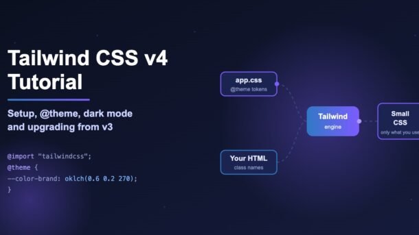
Tailwind CSS v4 is the biggest change to Tailwind since it was first released. There is no tailwind.config.js to start with, setup is one line of CSS, builds are much faster, and your design tokens (colors, fonts, spacing) now live in plain CSS variables. In this tutorial you will set up Tailwind CSS v4 from scratch, learn the new @theme, @utility and @custom-variant directives, add dark mode, and upgrade an old v3 project without breaking your design.
- Install with
npm install tailwindcss @tailwindcss/vite(Vite) or@tailwindcss/postcss(Next.js and other PostCSS setups). - Your whole setup is one line in CSS:
@import "tailwindcss"; - Customize colors, fonts and breakpoints inside
@theme { }using CSS variables — no JavaScript config needed. - Upgrading from v3? Run
npx @tailwindcss/upgradeon a new git branch, then check renamed classes likeshadow-sm → shadow-xsandring → ring-3. - Tailwind v4 needs modern browsers: Safari 16.4+, Chrome 111+ and Firefox 128+.
What is new in Tailwind CSS v4?
Tailwind CSS is a “utility-first” CSS framework. Instead of writing a .card class in a separate file, you style elements directly with small ready-made classes like p-4, rounded-xl and bg-white. Version 4 keeps that idea but rebuilds almost everything underneath it. The current release line is v4.3 (v4.3.3 at the time of writing), which added scrollbar utilities on top of the v4.0 foundation.
@import "tailwindcss";, replaces the three old @tailwind lines and the config file.content: [] array. Tailwind finds your template files on its own and skips anything in .gitignore.oklch() colors and 3D transforms work out of the box.postcss-import and autoprefixer are no longer needed.How Tailwind v4 works (in plain words)
Tailwind reads two things: your CSS entry file (where you import Tailwind and define your theme) and your source files (HTML, JSX, Vue, PHP and so on). It looks for class names in your source files and writes CSS only for the classes you actually used. That is why your final CSS file stays small even though Tailwind has thousands of possible classes.
How to install Tailwind CSS v4
Pick the tab that matches your project. Every method ends the same way: one CSS file that starts with @import "tailwindcss";. (Tabs below are pure CSS — click a label to switch.)
Step 1. Create a Vite project and install Tailwind with its Vite plugin:
npm create vite@latest my-app
cd my-app
npm install tailwindcss @tailwindcss/vite
Step 2. Add the plugin to vite.config.ts:
import { defineConfig } from 'vite'
import react from '@vitejs/plugin-react'
import tailwindcss from '@tailwindcss/vite'

export default defineConfig({
  plugins: [react(), tailwindcss()],
})
Step 3. Replace everything in src/index.css with:
@import "tailwindcss";Run npm run dev and you are done. The Vite plugin is the fastest option and is the one the Tailwind team recommends for Vite projects.
Step 1. In a Next.js app (or any PostCSS-based setup), install the PostCSS plugin:
npm install tailwindcss @tailwindcss/postcss postcssStep 2. Create postcss.config.mjs in the project root:
const config = {
  plugins: {
    "@tailwindcss/postcss": {},
  },
};

export default config;
Step 3. At the top of app/globals.css:
@import "tailwindcss";Make sure globals.css is imported in app/layout.tsx. If you are learning Next.js caching too, our guide on Next.js “use cache” pairs well with this setup.
No bundler? Use the standalone CLI. Install it and create src/input.css containing @import "tailwindcss";:
npm install tailwindcss @tailwindcss/cli
npx @tailwindcss/cli -i ./src/input.css -o ./dist/output.css --watch
Then link the output file in your HTML:
<link href="./dist/output.css" rel="stylesheet">This works well for plain HTML sites, PHP and WordPress themes, Django or Laravel templates.
For a quick experiment in a single HTML file, the Play CDN script compiles classes in the browser:
<script src="https://cdn.jsdelivr.net/npm/@tailwindcss/browser@4"></script>Use this only for demos and learning. It is slow for real users and is not meant for production websites.
@theme variables.Build your first component
Let’s make a simple, responsive profile card. Every class is explained right below the code.
<div class="mx-auto max-w-sm rounded-2xl bg-white p-6 shadow-lg ring-1 ring-slate-200">
  <div class="flex items-center gap-4">
    <img class="size-14 rounded-full object-cover"
         src="/avatar.jpg" alt="Profile photo of Priya" />
    <div>
      <h3 class="text-lg font-semibold text-slate-900">Priya Sharma</h3>
      <p class="text-sm text-slate-500">Frontend Developer, Pune</p>
    </div>
  </div>
  <p class="mt-4 text-slate-600">
    Loves React, clean UI and filter coffee.
  </p>
  <button class="mt-5 w-full rounded-lg bg-indigo-600 px-4 py-2.5 font-medium text-white
                 hover:bg-indigo-500 focus-visible:outline-2 focus-visible:outline-offset-2
                 focus-visible:outline-indigo-600 active:scale-95 transition">
    Follow
  </button>
</div>
mx-auto max-w-smcenters the card and limits its width.size-14sets width and height together (3.5rem each).ring-1 ring-slate-200draws a thin outline. In v4 you always give the ring a color.hover:,focus-visible:andactive:are variants — they apply a class only in that state.py-2.5works because v4 spacing is calculated from one base value (--spacing), so any number likep-13ormt-17is valid without extra config.
Responsive design and container queries
Responsive prefixes work like before: md:grid-cols-2 applies from the md breakpoint (48rem) upward. New in v4, container queries are built in. A container query reacts to the size of the parent box instead of the whole screen, which is perfect for reusable cards.
<!-- Mark the parent as a container -->
<section class="@container">
  <!-- 1 column by default, 2 columns when the CONTAINER is at least "md" wide -->
  <div class="grid grid-cols-1 gap-4 @md:grid-cols-2 @3xl:grid-cols-3">
    <article class="rounded-xl bg-white p-4 shadow">Card A</article>
    <article class="rounded-xl bg-white p-4 shadow">Card B</article>
    <article class="rounded-xl bg-white p-4 shadow">Card C</article>
  </div>
</section>
Customize Tailwind CSS v4 with @theme
In v3 you edited theme.extend inside tailwind.config.js. In v4 you write CSS variables inside an @theme block. Each variable name follows a pattern called a namespace: --color-* creates color classes, --font-* creates font classes, --breakpoint-* creates screen sizes, and so on.
src/index.css
@import "tailwindcss";

@theme {
  /* Colors → bg-brand-500, text-brand-500, border-brand-500 … */
  --color-brand-50:  oklch(0.97 0.02 275);
  --color-brand-500: oklch(0.60 0.20 275);
  --color-brand-700: oklch(0.45 0.18 275);

  /* Fonts → font-display */
  --font-display: "Poppins", "sans-serif";

  /* New breakpoint → 3xl:… */
  --breakpoint-3xl: 120rem;

  /* Custom easing → ease-fluid */
  --ease-fluid: cubic-bezier(0.3, 0, 0, 1);
}
Now you can write class="bg-brand-500 font-display 3xl:text-6xl ease-fluid". And because every theme value is a real CSS variable, you can also use it in normal CSS or inline styles: color: var(--color-brand-700);.
Replace or reset the default theme
The block above adds to Tailwind’s default colors. To remove all default colors and keep only your own brand palette, reset the namespace with initial:
@theme {
  --color-*: initial;          /* remove all default colors */
  --color-white: #fff;
  --color-black: #0b1020;
  --color-brand-500: oklch(0.60 0.20 275);
}
Using a font loaded by Next.js (@theme inline)
When a theme value points to another variable — for example a font loaded by next/font — use @theme inline so the real value is used where the class is applied:
@theme inline {
  --font-sans: var(--font-inter);
}
Custom utilities and variants
v4 replaces @layer utilities with a simpler @utility directive. Utilities made this way work with every variant automatically (hover:, md:, dark:…).
/* A one-off custom class */
@utility content-auto {
  content-visibility: auto;
}

/* A reusable button style built from Tailwind classes */
@utility btn-primary {
  @apply rounded-lg bg-brand-500 px-4 py-2 font-medium text-white;
}
Then use them like any other class: <section class="content-auto"> or <button class="btn-primary md:px-6">.
You can also create your own variants with @custom-variant. Here is a variant that applies styles when a parent has data-theme="midnight":
@custom-variant theme-midnight (&:where([data-theme="midnight"] *));

/* usage: <div class="bg-white theme-midnight:bg-slate-950"> */@reference "../app.css"; (path to your main CSS file) at the top of the <style> block. This gives access to your theme without duplicating CSS.Tell Tailwind about extra files with @source
Automatic scanning covers your project, but it skips node_modules and anything in .gitignore. If a UI library from npm uses Tailwind classes, register it:
@import "tailwindcss";
@source "../node_modules/@my-company/ui-lib";
Need an official plugin like Typography? Load it straight from CSS: @plugin "@tailwindcss/typography";
Dark mode in Tailwind v4
By default, dark: follows the user’s operating system setting (the prefers-color-scheme media query). Nothing to configure:
<div class="bg-white text-slate-900 dark:bg-slate-900 dark:text-slate-100">
  Hello, night owl!
</div>
Most websites also want a manual toggle button. In v3 you set darkMode: 'class' in the config. In v4 you redefine the dark variant in CSS:
@import "tailwindcss";

@custom-variant dark (&:where(.dark, .dark *));
Now dark: classes apply whenever an ancestor (usually <html>) has the dark class. A tiny React toggle that remembers the choice:
export function ThemeToggle() {
  function toggle() {
    const isDark = document.documentElement.classList.toggle("dark");
    localStorage.setItem("theme", isDark ? "dark" : "light");
  }
  return (
    <button onClick={toggle}
      className="rounded-lg border px-3 py-1.5 dark:border-slate-700">
      Toggle theme
    </button>
  );
}<head> that reads localStorage.theme and adds the dark class before the page paints.New utilities worth knowing
The v4.x releases keep adding features that used to need custom CSS. A few useful ones:
| Feature | Example classes | What it does |
|---|---|---|
| Container queries (v4.0) | @container, @md:flex | Style based on parent width, not screen width. |
| 3D transforms (v4.0) | perspective-distant, rotate-x-12 | Tilt and flip cards in 3D. |
| Gradients (v4.0) | bg-linear-45, bg-radial, bg-conic | Angled, radial and conic gradients. The new name for bg-gradient-to-r is bg-linear-to-r. |
| Entry animations (v4.0) | starting:opacity-0 | Animate elements when they first appear (uses @starting-style). |
| Text shadows (v4.1) | text-shadow-lg | Soft shadows behind text. |
| Masks (v4.1) | mask-b-from-50% | Fade an image or element out with a mask. |
| New color palettes (v4.2) | bg-mauve-200, text-olive-700 | Added mauve, olive, mist and taupe palettes. |
| Scrollbars (v4.3) | scrollbar-thin, scrollbar-thumb-slate-400 | Style scrollbar width and colors without custom CSS. |
A small example combining a few of these — a hero image that fades out at the bottom, with a thin styled scrollbar on a side list:
<img class="h-64 w-full object-cover mask-b-from-50%" src="/hero.jpg" alt="Mountain view at sunrise" />

<ul class="h-48 overflow-y-auto scrollbar-thin scrollbar-thumb-slate-400 scrollbar-track-transparent">
  <li class="p-2">Item 1</li>
  <!-- … -->
</ul>
If you enjoy new CSS features, also read our guide to CSS anchor positioning — it lets you build tooltips and dropdowns without JavaScript, and it combines nicely with Tailwind.
How to upgrade from Tailwind v3 to v4
The Tailwind team ships an automatic upgrade tool. It updates your dependencies, moves your JavaScript config into CSS and renames classes in your templates. It needs Node.js 20 or newer.
# 1. Work on a new branch so you can review every change
git checkout -b upgrade-tailwind-v4

# 2. Run the official upgrade tool
npx @tailwindcss/upgrade

# 3. Review the diff and test the app in the browser
git diff
npm run devClass names that changed
The upgrade tool renames most of these for you, but you should know them — especially when you copy old snippets from Stack Overflow or older tutorials.
| v3 class | v4 class | Why |
|---|---|---|
shadow-sm | shadow-xs | Sizes shifted to make room for a smaller step. |
shadow | shadow-sm | Bare names now have an explicit size. |
rounded-sm / rounded | rounded-xs / rounded-sm | Same size shift. |
blur-sm / drop-shadow-sm | blur-xs / drop-shadow-xs | Same size shift. |
outline-none | outline-hidden | outline-none now really sets outline-style: none. |
ring | ring-3 | Default ring width is now 1px, not 3px. |
bg-opacity-50 | bg-black/50 | Opacity classes removed; use the slash modifier. |
flex-grow / flex-shrink-0 | grow / shrink-0 | Old aliases removed. |
!font-bold | font-bold! | The “important” mark now goes at the end. |
bg-[--brand] | bg-(--brand) | New short syntax for CSS variables. |
bg-gradient-to-r | bg-linear-to-r | Preferred new name (it supports more gradient types). |
Behaviour changes to check by eye
- Border color:
bordernow usescurrentColorinstead of light gray. Add a color likeborder-slate-200wherever borders suddenly look dark. - Ring color: the default ring is also
currentColornow (it was blue). Addring-blue-500where you need it. - Hover on phones:
hover:now only applies on devices that support hover, so taps on mobile no longer leave “stuck” hover styles. - Buttons: buttons now use the default cursor. Add
cursor-pointerif you want the hand icon. - Old JS config:
tailwind.config.jsis no longer picked up automatically. If you still need it during migration, load it with@config "../tailwind.config.js";.
To keep the old v3 border look across the whole site while you migrate, add this to your CSS:
@layer base {
  *, ::after, ::before, ::backdrop, ::file-selector-button {
    border-color: var(--color-gray-200, currentColor);
  }
}
The official Tailwind CSS upgrade guide lists every change in detail.
Common Tailwind v4 errors and fixes
| Problem or error | Why it happens | Fix |
|---|---|---|
“It looks like you’re trying to use tailwindcss directly as a PostCSS plugin” | In v4 the PostCSS plugin moved to its own package. | Install @tailwindcss/postcss and use it in postcss.config.mjs. |
| No styles at all | CSS file still has the old @tailwind lines, or it is not imported in your app. | Use @import "tailwindcss"; and import that CSS file in your entry (main.tsx or layout.tsx). |
| “Cannot apply unknown utility class” in Vue/Svelte/CSS modules | The separate style block cannot see your theme. | Add @reference "../app.css"; at the top of that style block. |
| Classes from an npm UI library are missing | node_modules is not scanned. | Add @source "../node_modules/your-lib"; |
Dynamic classes like bg-${color}-500 do not work | Tailwind scans text; it cannot run your code to build class names. | Write full class names, e.g. a map: { red: "bg-red-500", green: "bg-green-500" }. |
| Borders look dark / rings look thin after upgrading | New defaults: currentColor borders and 1px rings. | Add explicit colors and use ring-3 where needed. |
Theme changes in tailwind.config.js are ignored | v4 does not auto-load JS config files. | Move values into @theme, or add @config temporarily. |
| Sass build errors with Tailwind | v4 is not designed to work with Sass, Less or Stylus. | Use plain CSS files — nesting and variables are already supported. |
Tailwind CSS v4 best practices
- Keep design tokens in
@theme. Brand colors, fonts and breakpoints belong there, not as random arbitrary values likebg-[#6c5ce7]scattered across files. - Prefer components over
@apply. In React, Vue or Svelte, a<Button>component is easier to maintain than a big CSS class. Use@utility+@applyonly for small, truly shared styles. - Sort classes automatically with
prettier-plugin-tailwindcssso long class lists stay readable in code reviews. - Use container queries for reusable cards and screen breakpoints for page layout.
- Merge conflicting classes safely in component libraries with a helper like
tailwind-merge, sop-2passed as a prop correctly overrides a defaultp-4. - Check accessibility: keep visible focus styles (
focus-visible:outline-2), enough color contrast, and realalttext on images. - Upgrade on a branch and compare key pages side by side before merging.
Frequently Asked Questions
Do I still need tailwind.config.js in Tailwind CSS v4?
No. New projects configure everything in CSS with @theme, @utility, @custom-variant, @source and @plugin. A JS config is still supported through @config, mainly to make upgrades easier.
Is Tailwind CSS v4 free?
Yes. Tailwind CSS is open source under the MIT license. Paid products such as ready-made UI kits are optional.
Does Tailwind v4 work with Next.js and React?
Yes. Use @tailwindcss/postcss for Next.js and @tailwindcss/vite for Vite-based React apps. New Next.js projects created with create-next-app can set up Tailwind for you.
Which browsers does Tailwind v4 support?
Safari 16.4+, Chrome 111+ and Firefox 128+. It relies on modern CSS features such as cascade layers and color-mix(). If you must support older browsers, stay on v3.4.
Can I use Tailwind v4 with Sass?
It is not recommended and not officially supported. Modern CSS already has nesting and variables, and Tailwind v4 handles imports, so you rarely need a preprocessor.
How do I add custom colors in Tailwind v4?
Add a variable inside @theme, for example --color-brand-500: oklch(0.6 0.2 275);. Tailwind then creates bg-brand-500, text-brand-500, border-brand-500 and more.
Conclusion
Tailwind CSS v4 makes the framework simpler to start with and nicer to customize. Setup is one @import line, your theme is plain CSS variables, and new utilities like container queries, masks and scrollbar styles remove a lot of custom CSS. Start a small Vite or Next.js project today, add your brand colors in @theme, and try the dark mode toggle from this guide. When you are comfortable, run npx @tailwindcss/upgrade on one of your older v3 projects. For full details, keep the official Tailwind CSS installation docs handy.
New posts every day on DevDojo
Practical tutorials on React, Next.js, Node.js, Python, AI and DevOps — written in simple English for developers in India and around the world. Bookmark DevDojo and leave a comment if you want a Tailwind topic covered next!